Open to work
Currently based
in New York

Rebrand Identity
High-tech, safe and versatile maintenance solutions that elevate the global aircraft sector. Always with the community at its core.


Context
Kraüss, specialized in aircraft maintenance services, faced a challenge common to many family-owned businesses: a solid trajectory and a strong bond with the community, but a visual identity that had been left behind. With over a decade of experience in the aerospace sector, the brand recognized the need to update its presence — aiming for greater authority, impact, and alignment with its current phase. The challenge was to design a striking logo and select colors that would capture the energy of a company that has spent over 10 years flying — and helping others take flight.
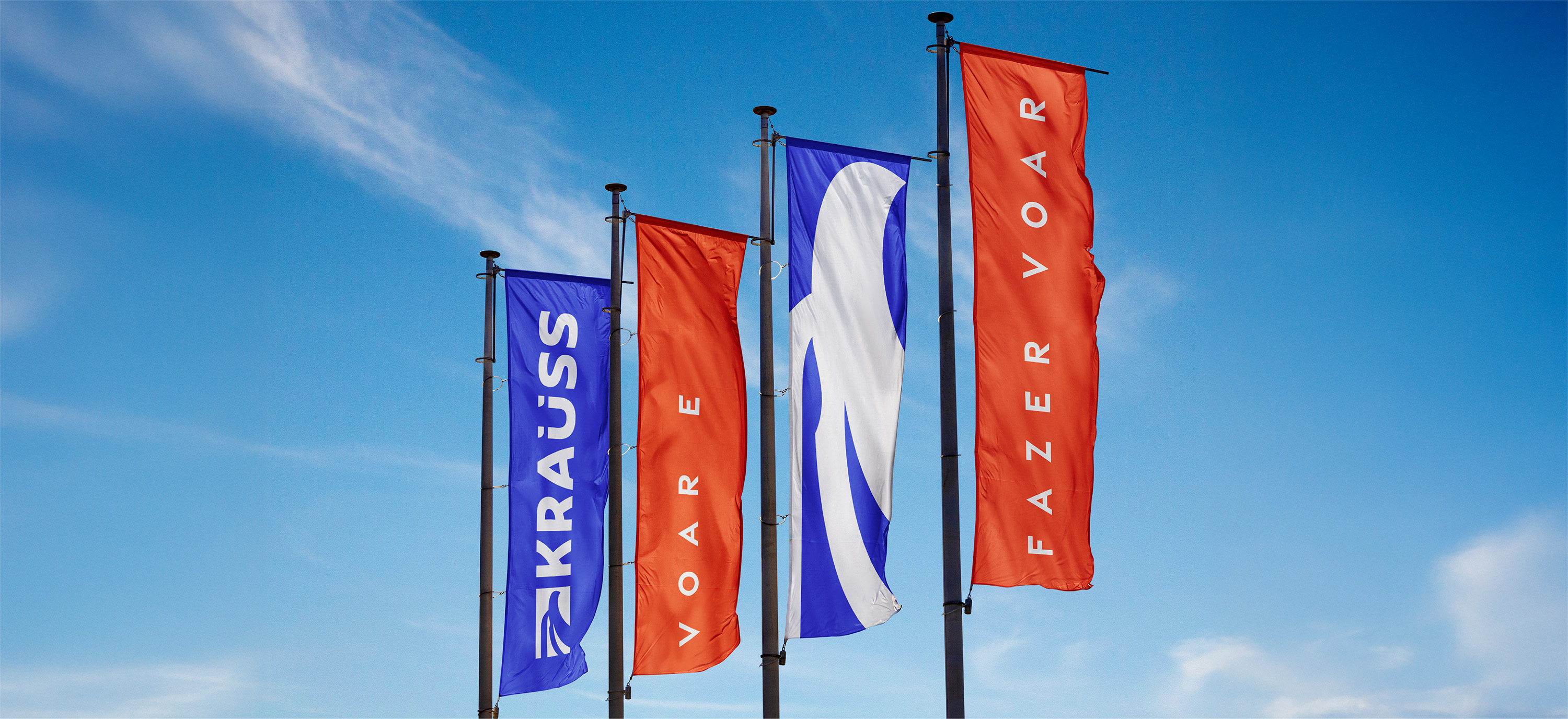
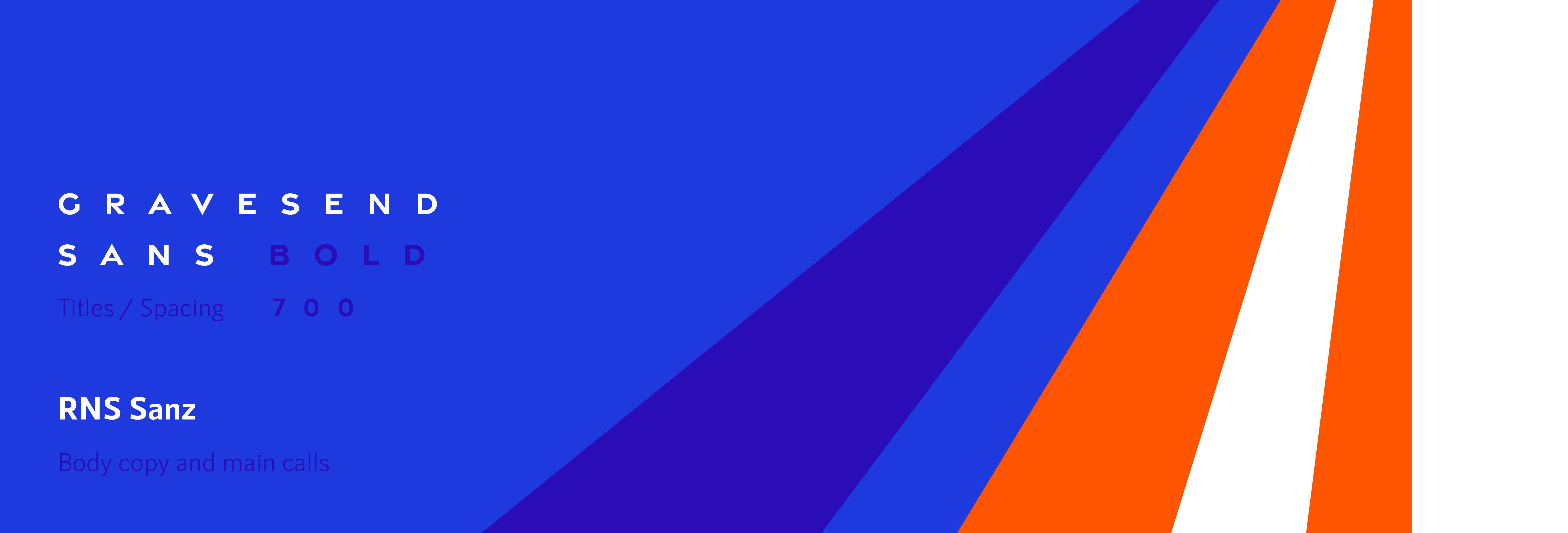
Inspired by the founder’s mantra “to fly and make others fly”, we brought this belief to the core of the new identity. The eagle was redesigned with more elegant lines, symbolizing vision and strength. The color palette combines blue and orange, a powerful mix. The new typography reinforces precision and professionalism, while the graphic elements reference flight, air routes, and disassembled aircraft parts, highlighting technical expertise and know-how. All together, the new identity visually expresses the brand’s purpose: to be a company that not only flies, but also helps its clients take flight — safely.
Problem Solved

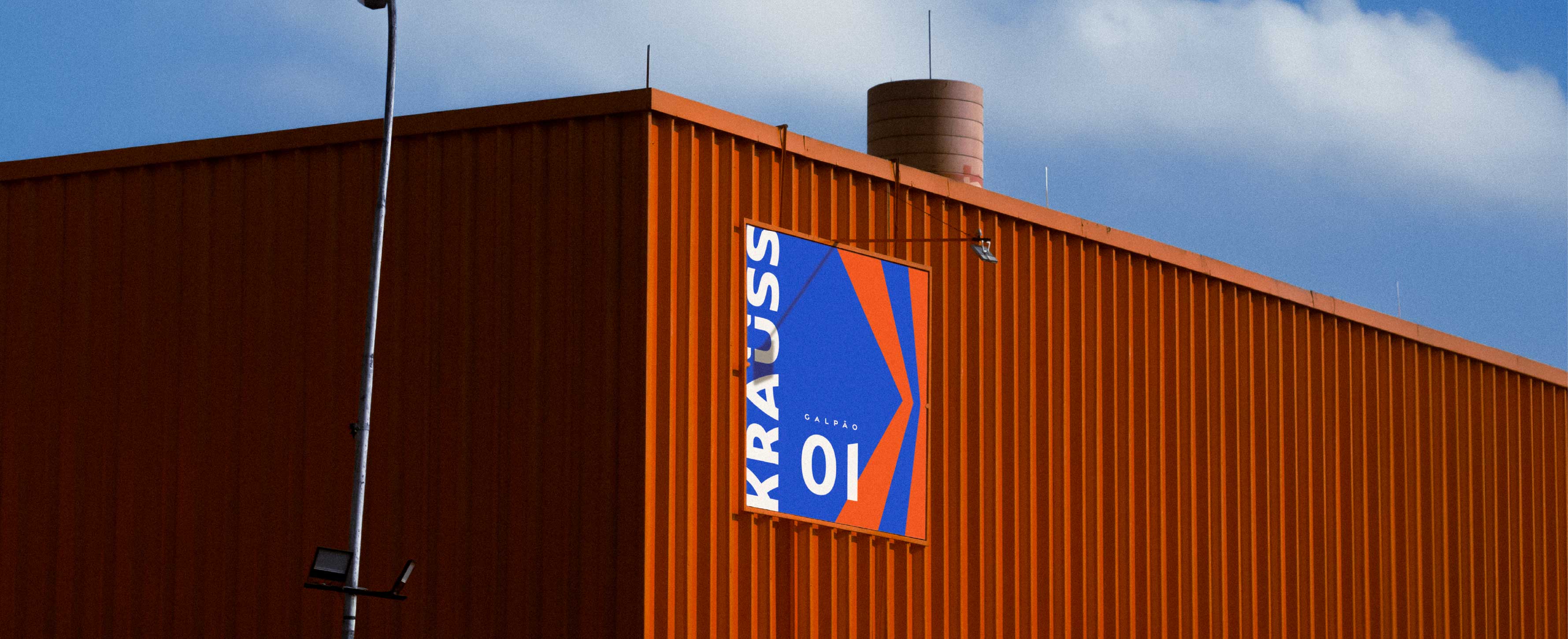
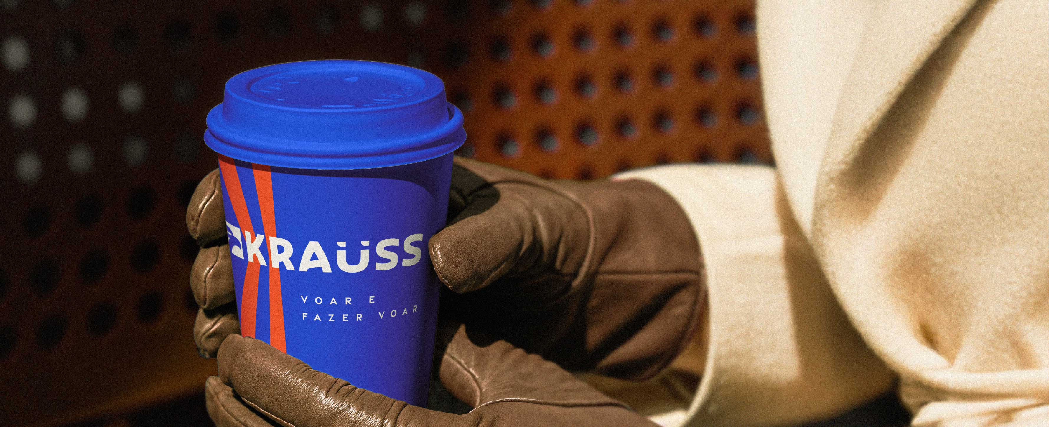
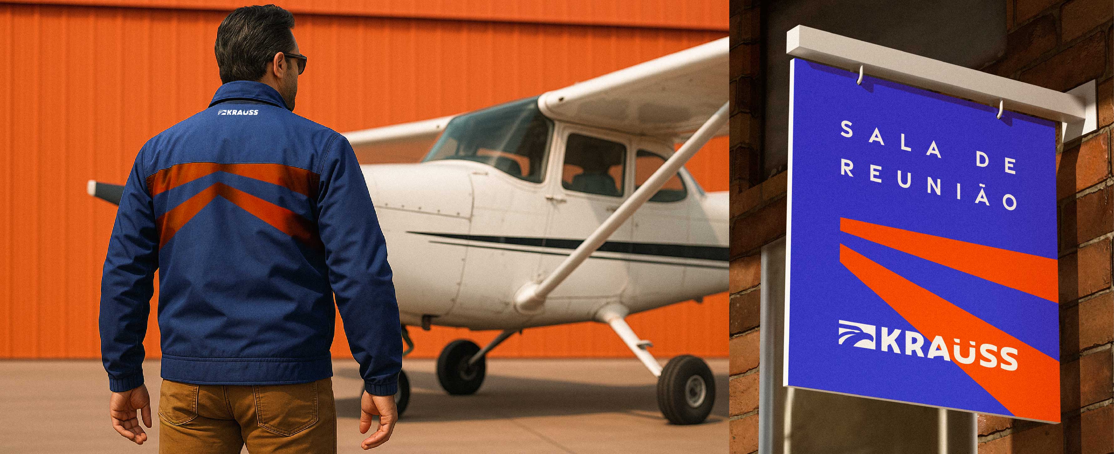
The new identity elevated Kraüss’ brand perception, aligning its visual language with the company’s technical excellence, professionalism, and passion for aviation. The system is now more cohesive, flexible, and ready for all touchpoints — from technical documents to digital platforms. The new visual positioned the brand ahead of competitors stuck in outdated visuals. Beyond solving an aesthetic gap, the rebranding gave Kraüss the tools to grow and move forward.
Results


Other Work
Inside the visual identities, thinking about packaging design, presentations, social media, everything everywhere all at once.
